

Reading the table
Distinguish owner wallet addresses from SmartAccount addresses. Debt is associated with the SmartAccount’s lending markets; free tokens, external positions, and recognized collateral can differ. A displayed infinity value can indicate no effective debt, while tiny balances may be formatted using UI dust rules. Health factor at or below 1.1 is the liquidation threshold. Distribution bins and heatmap colors are presentation choices. They do not add separate contract rules or prove a transaction will succeed.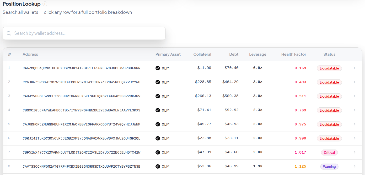
Earlier lookup table. Example addresses and health values do not identify current liquidation candidates. Click the image to zoom.
Freshness
Account discovery, RPC reads, cached snapshots, and history have different update times. A missing account or unavailable leg should not be interpreted as a zero-risk position. Open the relevant detail view and refresh before acting on a tight threshold.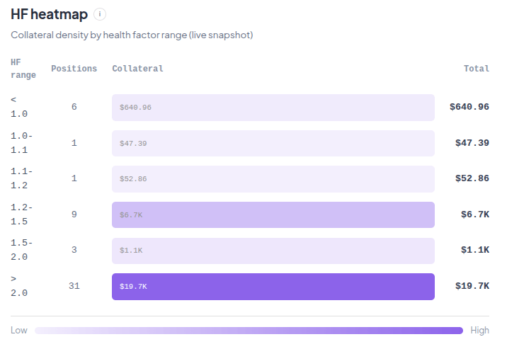
Historical heatmap example. The live snapshot label belongs to the original capture, not this static documentation image. Click the image to zoom.